Besides automatically creating kerning pairs for pair adjustment lookups, FontCreator can automatically add numerous other OpenType layout features to your font. Do ensure your glyphs have friendly name as explained here. Within the OpenType Designer window click the first icon from the upper left corner. You will now be able to select which features you want to generate and/or update.

The generated lookups and classes have names that start with a script abbreviation. E.g. latn_liga for standard Latin based ligatures. When the features are updated, the existing lookups and classes will be deleted, so if you add custom features, better avoid mixing them with the generated features.
Note: Greek and Cyrillic characters are grouped together with Latin (latn).
Unless noted otherwise, the generation of features and lookups is limited to Latin, Greek, and Cyrillic scripts.
Anchor Based Positioning (ccmp, mark, mkmk)
Position mark glyphs with respect to mark and base glyphs and also compose and substitute several glyphs.
If your font contains glyphs with anchors, then you can generate positioning features based on those anchors. Use complete composites to automatically generate anchors and build composites based on those anchors.
If you want to use different marks for upper and lower case letters, do add mark variants with a .case suffix. If you need special marks for narrow letters, like i and j, create additional mark glyphs with a .narrow suffix. If you want additional marks for small capitals, use .smcp; for petite capitals, use .pcap. If you want to use marks for both small capitals and petite capitals, add marks with a .cap suffix.
Capital Spacing (cpsp)
Globally adjusts inter-glyph spacing for all-capital text. Most typefaces contain capitals and lowercase characters, and the capitals are positioned to work with the lowercase. When capitals are used for words, they need more space between them for legibility and esthetics.
You can choose to increase the space by adding a uniform percentage of the advance width of each glyph (recommended per the specification), or a fixed value as indicated by a percentage of upem.
Cursive Positioning (curs)
In cursive scripts like Arabic, this feature cursively positions adjacent glyphs.
This feature is used in cursive scripts and will make use of entry and exit anchor points. For cursive scripts, ensure that each initial glyph has an exit anchor point, each medial glyph has both entry and exit anchor points, and each final glyph has an entry anchor point.
Fractions (diagonal) (frac)
Replaces figures separated by a slash with diagonal fractions. If the extended option is selected, it will generate lookups with contextual substitutions.
For this feature to work, these glyphs are required:
Digits (zero-nine), and optionally parenleft, parenright, hyphenminus, minus, plus, etc. as well as the variants for denominators with suffix .dnom, .subs, or inferior, and for numerators .numr, sups, or superior. At least the digits must have the same suffix, but in general it is best to use the same suffix for all denominators, and the same suffix for all numerators.
Also required are slash and fraction; optionally are space and thinspace.

If not all required glyphs are available, or if the extended option is not selected, it will create a ligature lookup with the following pre-composed fractions:
onehalf, zerothirds, onethird, twothirds, onequarter, threequarters, onefifth, twofifths, threefifths, fourfifths, onesixth, fivesixths, oneseventh, oneeighth, threeeighths, fiveeighths, seveneighths, oneninth, and onetenth.
Alternative Fractions (afrc)
Replaces figures separated by a slash with an alternative form; usually stacked/ nut fractions.
Will generate a ligature lookup for these glyphs:
onehalf.afrc, onethird.afrc, twothirds.afrc, onequarter.afrc, threequarters.afrc, onefifth.afrc, twofifths.afrc, threefifths.afrc, fourfifths.afrc, onesixth.afrc, fivesixths.afrc, oneseventh.afrc, twosevenths.afrc, threesevenths.afrc, foursevenths.afrc, fivesevenths.afrc, sixsevenths.afrc, oneeighth.afrc, threeeighths.afrc, fiveeighths.afrc, seveneighths.afrc, oneninth.afrc, twoninths.afrc, fourninths.afrc, fiveninths.afrc, sevenninths.afrc, eightninths.afrc, onetenth.afrc, threetenths.afrc, seventenths.afrc, ninetenths.afrc, onesixteenth.afrc, threesixteenths.afrc, fivesixteenths.afrc, sevensixteenths.afrc, ninesixteenths.afrc, elevensixteenths.afrc, thirteensixteenths.afrc, fifteensixteenths.afrc, onethirtysecond.afrc, threethirtyseconds.afrc, fivethirtyseconds.afrc, seventhirtyseconds.afrc, ninethirtyseconds.afrc, eleventhirtyseconds.afrc, thirteenthirtyseconds.afrc, fifteenthirtyseconds.afrc, seventeenthirtyseconds.afrc, nineteenthirtyseconds.afrc, twentyonethirtyseconds.afrc, twentythreethirtyseconds.afrc, twentyfivethirtyseconds.afrc, twentyseventhirtyseconds.afrc, twentyninethirtyseconds.afrc, thirtyonethirtyseconds.afrc, onesixtyfourth.afrc, threesixtyfourths.afrc, fivesixtyfourths.afrc, sevensixtyfourths.afrc, ninesixtyfourths.afrc, elevensixtyfourths.afrc, thirteensixtyfourths.afrc, fifteensixtyfourths.afrc, seventeensixtyfourths.afrc, nineteensixtyfourths.afrc, twentyonesixtyfourths.afrc, twentythreesixtyfourths.afrc, twentyfivesixtyfourths.afrc, twentysevensixtyfourths.afrc, twentyninesixtyfourths.afrc, thirtyonesixtyfourths.afrc, thirtythreesixtyfourths.afrc, thirtyfivesixtyfourths.afrc, thirtysevensixtyfourths.afrc, thirtyninesixtyfourths.afrc, fortyonesixtyfourths.afrc, fortythreesixtyfourths.afrc, fortyfivesixtyfourths.afrc, fortysevensixtyfourths.afrc, fortyninesixtyfourths.afrc, fiftyonesixtyfourths.afrc, fiftythreesixtyfourths.afrc, fiftyfivesixtyfourths.afrc, fiftysevensixtyfourths.afrc, fiftyninesixtyfourths.afrc, sixtyonesixtyfourths.afrc, sixtythreesixtyfourths.afrc.
Lining Figures (lnum)
This feature replaces selected non-lining figures with lining figures. Various characters designed to be used with figures may also have lining versions, e.g. plus.lnum, equal.lnum, multiply.lnum, divide.lnum, etc.
•If the default digits (zero-nine) are non-lining, then you could add Lining Figures named zero.lnum, etc.
•If the default digits are the preferred lining figures, there is no need to add this feature.
Oldstyle Figures (onum)
This feature replaces selected figures from the default or lining style with the Oldstyle form. Various characters designed to be used with figures may also have Oldstyle versions.
•If the default digits (zero-nine) are lining figures, then you could add Oldstyle Figures named zero.onum, etc.
•If the default digits are Oldstyle Figures, there is no need to add this feature.
Tabular Figures (tnum)
This feature replaces figure glyphs set on proportional widths with corresponding glyphs set on uniform (tabular) widths. Tabular widths are generally the default.
•If tabular figures are the default, there is no need to add this feature.
Otherwise add these:
•If the default digits are lining, but not fixed width, you could add Tabular Figures named zero.tnum, etc.
•If the default digits are lining and fixed width, you could add Oldstyle Tabular figures named zero.onum.tnum, etc.
•If the default digits are Oldstyle and fixed width, you could add lining tabular figures named zero.lnum.tnum, etc.
Proportional Figures (pnum)
This feature replaces figures set on uniform (tabular) widths with corresponding glyphs set on glyph-specific (proportional) widths.
•If proportional figures are the default, there is no need to add this feature.
Otherwise add these:
•If the default digits are fixed width, you could add accompanying Proportional Figures named zero.pnum, etc.
•If the default digits are lining figures, you could add Oldstyle Proportional Figures named zero.onum.pnum, etc.
•If the default digits are Oldstyle Figures, you could add lining proportional figures named zero.lnum.pnum, etc.
Figure it out!
To let the four features above work together when the default figures are lining tabular figures, you need to add all these:
1.zero-nine.onum (Oldstyle Tabular Figures)
2.zero-nine.pnum (Lining Proportional Figures)
3.zero-nine.onum.pnum (Oldstyle Proportional Figures)
Scientific Inferiors (sinf)
Replaces Lining or Oldstyle Figures with inferior figures (smaller glyphs that sit lower than the standard baseline, primarily for chemical or mathematical notation). May also replace lowercase characters with alphabetic inferiors.
Works with variants for glyphs with suffix .sinf (e.g. five.sinf) or inferior (sixinferior).
Slashed Zero (zero)
Replaces a default form of zero with an alternative form, which, for example, uses a diagonal slash through the counter to distinguish between 0 and O (zero and capital O).
Works with variants for glyphs with suffix .zero (e.g. zero.zero).
Localized Forms (locl)
Many scripts used to write multiple languages over wide geographical areas have developed localized variant forms of specific letters, which are used by individual literary communities. For example, a number of letters in the Bulgarian and Serbian alphabets have forms distinct from their Russian counterparts and from each other. In some cases the localized form differs only subtly from the script “norm”, in others the forms are radically distinct. This feature enables localized forms of glyphs to be substituted for default forms.
The common localized forms are:
•Catalan Punt Volat
In Catalan there are words like lletres and estrella that use a "double L", but there are also words which contain two Ls that each belong to a separate syllable, for example col·legi. In that case a “punt volat” (flying point) is used between two Ls. This feature adds a contextual lookup which substitutes:
L periodcentered -> Lmiddledot
l periodcentered -> lmiddledot
•Dutch IJ
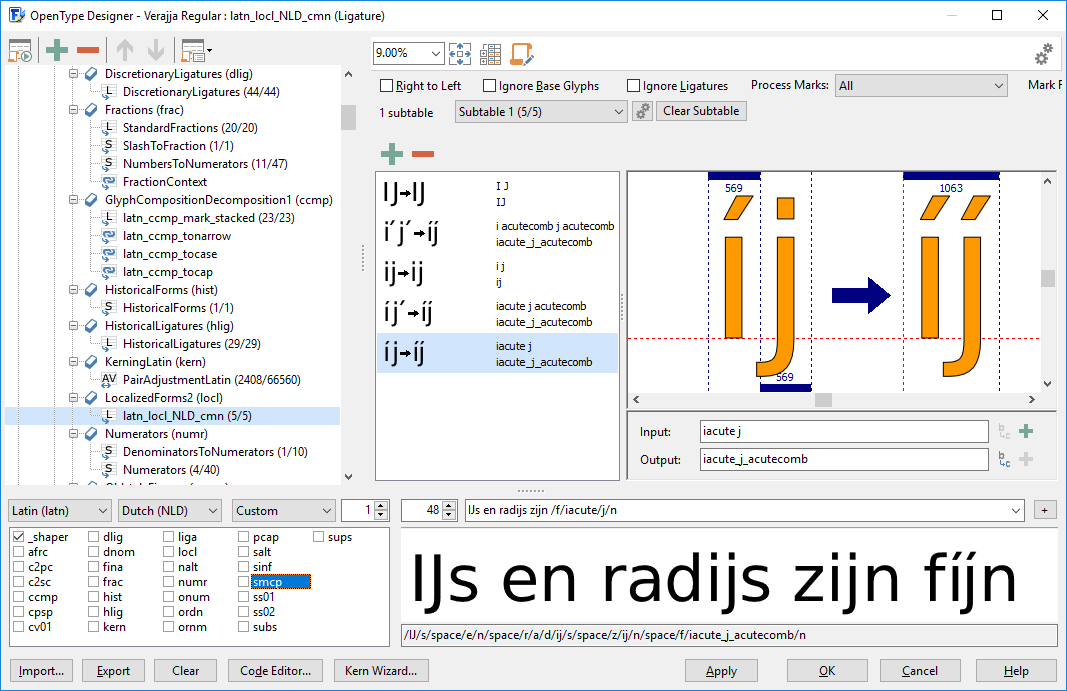
In the Dutch language, IJ (lange ij) is sometimes considered a ligature, or even a letter in itself. This feature adds substitutions for IJ and ij as well as variants with acute accents (Iacute_J_acutecomb and iacute_j_acutecomb).
•Romanian Comma Accent
The Romanian language uses S/s and T/t with a commaaccent. Due to legacy some text and/or fonts incorrectly use S/s and T/t cedilla. This feature substitutes the commaaccent variants for both Romanian and Moldavian languages.
•Turkish Dotless i
Unlike most Latin based languages, Turkish have both an i with a dot and a dotless i and also the capital I and a capital I with a dot. This features prevents issues with common substitutions and mark positioning for these languages: Turkish, Azerbaijani, Crimean Tatar, Kazakh, and Tatar. This feature requires a glyph named i.dotaccent.
A combination of “iacute j” is common in several languages (for example the Spanish municipality Níjar), but in Dutch words the i and j belong together, so both have either a dot or acute above the base characters. However jacute is not part of Unicode, so that character does not exist. To allow for proper usage in Dutch text, fonts can make use of the locl feature.

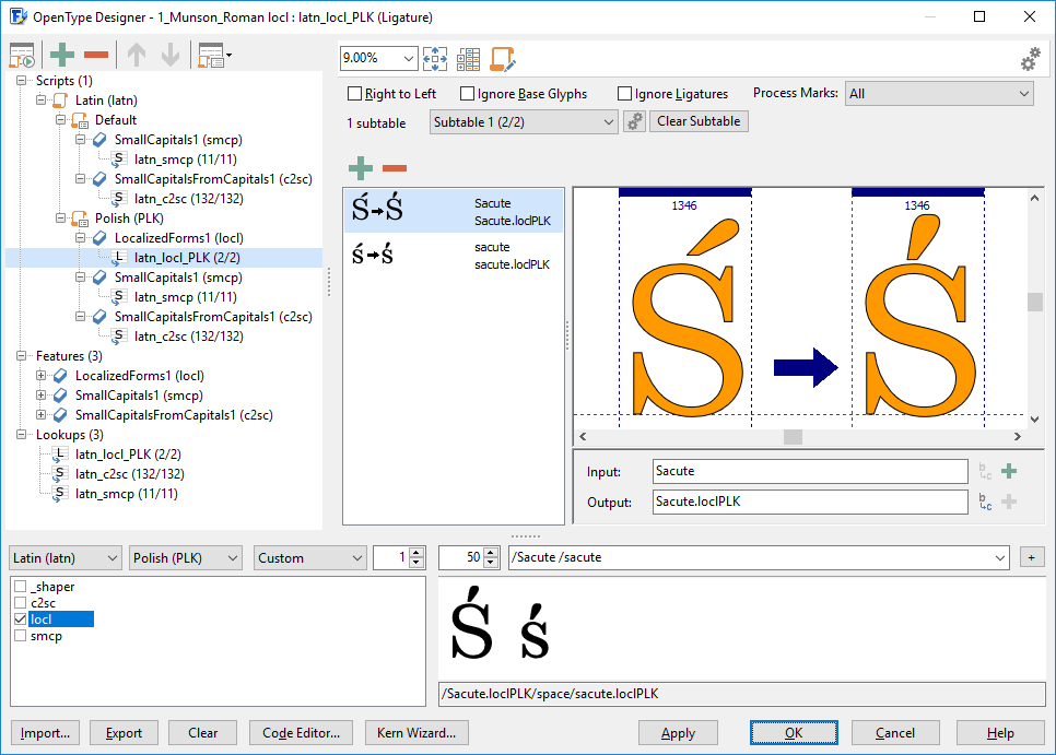
Custom localized forms use glyphs with a .loclLANG suffix to cover localized substitutions and ligatures. In this context LANG is one or more language tags separated by an underscore. For example A.loclFRA or B.loclENG_ESP. Currently only Latin based language tags, and Greek (ELL), Cyrillic (SRB, BGR), Arabic (ARA), and Hebrew (IWR) are supported. Some fonts may benefit from Polish forms, as the letters ć, ń, ó, ś, ź make use of the kreska (a diacritic used in the Polish alphabet, graphically similar to the acute accent). Add glyphs for such localized forms, naming them Sacute.loclPLK etc.

Tip: Use Test Web Font (CTRL + F5) to test the font on the Web Font test page. To enable localized forms in Word; select the text, apply the correct font and make sure you’ve activated at least standard ligatures. Finally select the correct language. To enable it in InDesign, select the language on the character panel. You can also test localized forms within the preview panel in FontCreator, just be sure you select the correct Script and Language as shown above.
Access All Alternates (aalt)
This feature makes all variations of a selected character accessible.
Works with variants for glyphs with all suffixes.
Standard Ligatures (liga)
This feature is used to map glyphs to their optional ligated form. It replaces a sequence of glyphs with a single glyph which is preferred for typographic purposes.
This feature covers these ligatures along with all glyphs with a .liga suffix:
ff, fi, fl, ,ffi, and ffl
Note: By default shaping engines should process the liga feature, but a user should be able to deactivate it. If the font has ligatures that should be formed all of the time, do define them in rlig.
Historical Ligatures and Historical Forms (hlig, hist)
Replaces a sequence of glyphs with a single glyph which is preferred for typographic purposes.
This feature adds a substitution for the long form of s (longs) to hist and replaces the default (current) forms with the historical alternates to hlig for all glyphs with a .hlig suffix.
Discretionary Ligatures (dlig)
Replaces a sequence of glyphs with a single glyph covering ligatures which may be used for special effect.
This feature covers ligature glyphs with a .dlig suffix.
Note: This feature is not processed by default, but can be activated by the user.
Small Capitals (smcp, c2sc)
This option turns characters into small capitals.
This feature covers glyphs with one of these suffixes: .smcp .c2sc .sc
We recommend to use lower case character names, for both, so if you’ve defined a.smcp it will be used in smcp feature (a -> a.smcp) and c2sc feature (A -> a.smcp). If you need to differentiate between upper and lower case substitutions, then define both variants. E.g. for germandbls (German letter Eszett).

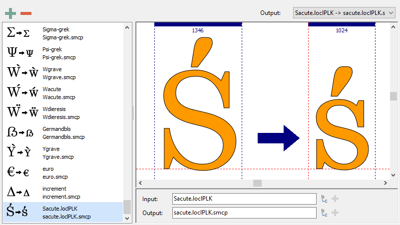
You can also combine features, by adding more than one suffix. If you also include localized small caps, name those sacute.loclPLK.smcp, etc.

Petite Capitals (pcap, c2pc)
This option turns characters into petite capitals. This additional size of capital letters, shorter than the regular small capitals allow a font with a small lowercase x-height to better harmonise with lowercase text than the taller small capitals.
This feature covers glyphs with one of these suffixes: .pcap .c2pc .pc
Similar to Small Capitals, we recommend to use lower case character names, e.g. a.pcap
Subscript (subs)
Replaces a default glyph with a subscript glyph.
Works with variants for glyphs with suffix .subs (e.g. four.subs) or inferior (fourinferior).
Superscript (sups)
Replaces a default glyph with a superscript glyph.
Works with variants for glyphs with suffix .sups (e.g. four.sups) or superior (foursuperior).
Stylistic Sets (ss01-ss20)
These allow for sets of stylistic variant glyphs corresponding to portions of the character set, e.g. multiple variants for lowercase letters in a Latin font.
This feature covers glyphs with one of these suffixes: .ss01 .ss02 etc.
Note: FontCreator supports feature parameters for stylistic sets.
Stylistic Alternates (salt)
This feature links to the same substitution lookup as used with stylistic set 01 (latn_ss01).
An additional substitution lookup will be added for glyphs with a .salt suffix.
Character Variants (cv01-cv99)
A Character Variant feature should apply only to one character or a set of characters closely related in this way.
This feature covers glyphs with one of these suffixes: .cv01 .cv02 etc. If there are more than one alternate for a given character, do add an additional suffix. For example this will work in case you have three different variants for Latin capital letter Agrave and you wish to include them in cv01:
Agrave.cv01
Agrave.cv01.modern
Agrave.cv01.yourdescription
Note: FontCreator supports feature parameters for character variants.
Case-Sensitive Forms (case)
Mainly used to shift various punctuation marks up to a position that works better with all-capital sequences or sets of lining figures.
Works with variants for glyphs with .case suffix.
Titling (titl)
Replaces the default glyphs with corresponding forms designed specifically for titling. These may be all-capital and/or larger on the body, and adjusted for viewing at larger sizes.
Works with variants for glyphs with .titl suffix.
Swash (swsh)
Replaces default character glyphs with corresponding swash glyphs. Note that there may be more than one swash alternate for a given character.
This feature covers glyphs with a .swsh suffix. Similar to the approach with character variants; add an additional suffix after .swsh if you have more than one alternate for a given character.
Ornaments (ornm)
This generates a dual-function feature, which uses two input methods to give the user access to ornament glyphs (e.g. fleurons, dingbats and border elements) in the font. One method replaces the bullet character ($2022) with a selection from the full set of available ornaments; the other replaces alphanumeric characters (A-Z and a-z) with ornaments assigned to them. The first approach supports the general or browsing user; the second supports the power user.
Works with variants for glyphs with suffix .ornm (e.g. a.ornm). The first approach requires the bullet character ($2022). The second approach requires alphanumeric characters and their corresponding .ornm variants.
Alternate Annotation Forms (nalt)
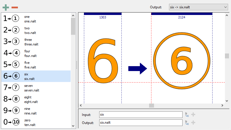
Replaces default glyphs with various notational forms (e.g. glyphs placed in open or solid circles, squares, parentheses, diamonds or rounded boxes).
This feature covers glyphs with a .nalt suffix. If the font doesn’t contain .nalt glyphs, this feature will be generated based on the circled characters as defined in Unicode block Enclosed Alphanumerics, e.g. oneCircled.

Ordinals (ordn)
Replaces default alphabetic glyphs with the corresponding ordinal forms for use after figures. It uses a ligature lookup to replace either “No.” or “No” with the numero character ($2116).
The “numero” along with “N”, “o”, and “.” are required for the ligature lookup.
The extended option makes use of glyphs with a .ordn suffix, otherwise it will add substitutions for a and A to ordfeminine ($AA) and o and O to ordmasculine ($BA).
Initial, Medial, Terminal, and Isolated Forms (init, medi, fina, isol, med2, fin2, fin3)
Replaces glyphs for characters that have applicable joining properties with an alternate form when occurring in an initial context.
These forms are not to be used with Latin script, but are meant for Arabic and other scripts that make use of joining properties.
Add the appropriate suffix to the glyphs you wish to cover. Some characters already come with the correct suffix to work with these options, e.g beeh-arab.init and veh-arab.fina.
Note: features med2, fin2, and fin3 are only used with Syriac script.