FontCreator Tutorials
TrueType vs. PostScript: Font Design Essentials
written by Erwin Denissen, published August 19, 2024
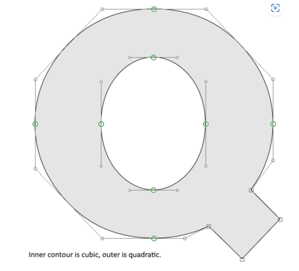
When designing and exporting fonts, understanding the underlying curve types—TrueType (quadratic Bézier curves) and PostScript (cubic Bézier curves)—is essential for achieving the best results. This article explores the differences between these curve types, why most font designers prefer working with cubic curves, considerations when exporting your final font, and the impact of these choices on font rendering across different platforms.
1. Designing with Cubic Bézier Curves (PostScript)
-
Familiarity with Design Tools: Most font designers prefer to design glyph outlines using cubic Bézier curves, the foundation of PostScript outlines. These curves behave exactly like those in popular design applications like Adobe Illustrator, making them more intuitive and familiar to work with. Designers appreciate the precision and control that cubic curves offer, as they allow for more complex and smoother shapes.
-
Control and Precision: Cubic Bézier curves are defined by two endpoints and two control points, offering greater flexibility in shaping curves. This control is particularly valuable for complex glyphs where subtle adjustments are needed to achieve the desired visual effect, allowing for a smoother and more refined design process.

2. TrueType Curves: Quadratic Bézier Curves
-
Quadratic Simplicity: TrueType outlines use quadratic Bézier curves, which are defined by two endpoints and a single control point. While they offer less control than cubic curves, they are simpler and more efficient for rendering on screens, especially on lower-resolution devices. This simplicity contributes to more predictable and faster rendering on a wide range of digital platforms.
-
Hinting Advantages: TrueType’s hinting model is highly sophisticated, allowing for precise adjustments to glyph rendering at small sizes. This grid-fitting process ensures that text remains legible and crisp across different screen resolutions, which is a key advantage of using quadratic curves. However, it’s important to note that macOS and iOS ignore built-in hinting information, relying instead on their own rendering methods. This means that fonts on these platforms might not display as intended if they rely heavily on hinting adjustments.
3. Exporting Fonts: Understanding .ttf and .otf
-
The TTF and OTF Misconception: There’s a common misconception that .ttf and .otf refer to specific font formats, but these are actually just file extensions. Historically, .ttf was associated with fonts using TrueType outlines, while .otf was used for fonts with CFF (Compact Font Format) outlines, which are based on cubic Bézier curves. However, .otf files can also contain TrueType outlines, so the file extension alone doesn’t indicate whether a font uses TrueType or PostScript outlines.
-
OpenType Specification: Both TrueType and CFF-based flavors are considered OpenType fonts today, as outlined in the OpenType specification. What truly matters is not the file extension, but the presence of OpenType layout features, which can be included in both TrueType and CFF-based fonts. These features enhance font functionality and support advanced typographic capabilities.
-
Conversion to TrueType: Given the efficiency and hinting advantages of TrueType, many designers choose to export their fonts with quadratic Bézier curves, even if they designed using cubic curves. Most modern font editors, including FontCreator, handle this conversion automatically. This ensures that the final output is optimized for both print and screen use, accommodating a wide range of devices and applications.
-
Exporting with Cubic Curves: Some designers prefer to export their fonts with the original cubic Bézier curves. This option preserves the original design intent but may require more careful consideration of the target platforms.
-
Dual Export: In some cases, designers might choose to export two versions of their font—one with quadratic curves (TrueType) for screen and web use, and another with cubic curves (PostScript) for print. This dual approach ensures that the font performs optimally across different mediums, taking advantage of the strengths of each curve type.
4. Variable Fonts and Curve Considerations
-
Prevalence of TrueType in Variable Fonts: Most variable fonts are exported with TrueType outlines because of the fallback mechanism they provide. If a system or application doesn’t support variable fonts, it can still display a static instance of the font. This fallback ensures broader compatibility and reliable display across different environments. In contrast, PostScript-based variable fonts lack this fallback mechanism, which can result in the font not displaying at all on unsupported systems.
-
Impact on Design Choices: When designing variable fonts, the choice of curve type can significantly influence the final product’s versatility and compatibility. Designers should consider the end-use scenarios and whether their font will be primarily used in digital or print environments. The widespread use of TrueType outlines in variable fonts underscores their practicality for web and digital applications.
5. Final Thoughts
Understanding the differences between TrueType and PostScript curves, along with their respective hinting models and rendering behaviors, is crucial for font designers. While most designers prefer the familiarity and control of cubic Bézier curves during the design process, the decision on how to export the final font—whether with quadratic or cubic curves—depends on the intended use and the need for compatibility across different platforms, particularly in variable font contexts. Moreover, knowing how different operating systems handle hinting can help designers make informed choices to ensure their fonts display as intended across all environments.