FontCreator Tutorials
Font Metrics – Vertical Line Spacing
This article was originally published June 12, 2019. Updated December 3, 2022.
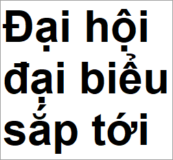
At some point in designing a font (preferably at an early stage) you might be confronted with the limited space above and below characters. For example, it can be challenging to add support for Vietnamese as it has numerous capital letters with two diacritical marks above. Using special stacking combining marks helps, nevertheless it is important to set correct spacing metrics in your font.
Word processors, page layout software, e-readers, game engines, web browsers, PDF producers, and printer drivers don’t use the same mechanism to determine the line spacing. This tutorial provides information and examples, that show what font metrics work best for your font. We also discuss how easy it is to define these values with FontCreator, but the advice in this tutorial is also applicable to other font editors.

Outdated and Incorrect Information
Over the years both OpenType specification and recommendations related to these metrics have changed, so there is a lot of outdated and incorrect information about this topic floating around on the Internet.
Spacing Metrics
Before the advent of OpenType, there were TrueType fonts solely for Windows, and Postscript fonts for Macintosh. OpenType was invented as a universal (cross-platform) vector-based font format, but it came with compatibility/legacy metrics with platform-specific behavior. That is why, within an OpenType font resource, there are three groups of spacing metrics: Typographic, Windows, and Macintosh.

Use Typo Metrics for Line Spacing
To overcome these compatibility issues, a new flag was introduced in the OpenType specification. If the font has enabled “Use typo metrics for line spacing”, which we highly recommend, all applications should use these cross-platform values to determine default line spacing.
If the font has set this flag “Use typo metrics for line spacing”, then Microsoft Word uses the Typographic values. Otherwise it uses WinAscent and WinDescent along with LineGap as default line spacing.
On Windows, text will be clipped above these used ascender and descender values, so ensure that all your glyph outlines are within the visual (non-clipping) zone.
More and more applications use the Typographic Spacing Metrics values, but mainly legacy software still uses either Windows or Macintosh specific metrics. For consistent line spacing without clipping, we recommend the following approach.
Typographic (OS/2 -> Typo Ascender, Typo Descender, and Typo Line Gap)
Typo Ascender and Typo Descender should at least sum to “units per em” (upem). Take the maximum and minimum vertical outline positions from all glyphs that cover the primary languages your font supports. Usually an extended Latin character set, for example Unicode blocks Basic Latin along with Latin-1 Supplement, will do. Then proportionally increase the values so that they total upem.
Set the Typo Line Gap value between 7% and 25% of upem, so that the total of all three Typographic values makes a good default line spacing.
Windows (OS/2 -> Win Ascent and Win Descent)
WinAscent and WinDescent should accommodate the maximum and minimum vertical outline positions from all glyphs. Proportionally increase the values so that WinAscent - WinDecent is at least equal to TypoAscender - TypoDescender + TypoLineGap.
Macintosh (hhea -> Ascender, Descender, and Line Gap)
These values represent the design intentions of the font's creator rather than any computed value, and individual glyphs may well exceed the limits they represent. Some applications (mainly Mac based) use or used these metrics.
Simply set these to match the corresponding Typographic Spacing Metrics values.
How to Calculate the Values?
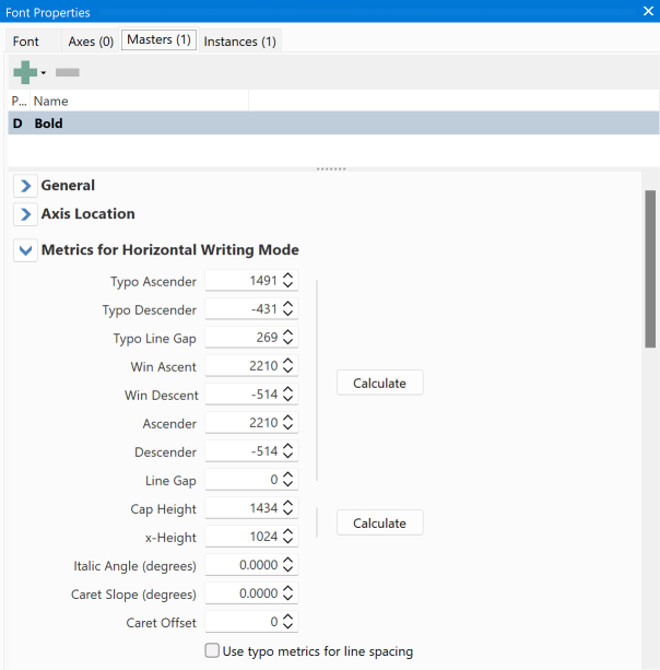
Now that you better understand how to set vertical spacing values, it is still not easy to manually calculate all these values. Fortunately, FontCreator has a button that does all the magic for you:

Adjust the line gap values to your liking and ensure you agree with the calculated values. Test the font on Windows, Macintosh, Web browsers, and applications like Microsoft Word, and Adobe InDesign.
Font Families
Use the same values for style linked typefaces (e.g. regular, italic, bold, and bold italic fonts), so that the document layout won’t reflow when changing the font style.
Remaining Issues and Thoughts
Some fonts (for complex scripts) might contain base characters and combining marks that when used together can exceed the calculated limits. In such cases you should consider increasing the spacing metrics.
Other requirements apply for CJK (Chinese, Japanese, and Korean) fonts that are intended to be used for vertical layout.
You may find it impossible to get a good balance between consistent layout across different applications and aesthetic spacing. If the outlines are too small or too large, you should consider increasing or reducing the size of your glyph outlines. We consider outlines too small if the CapHeight is less than ½ upem, and it is too large if is exceeds ¾ upem.
Feedback
Your feedback, suggestions for improvements, and questions related to this and other tutorials are welcome; please post them to the High-Logic Font Forum.
Updated December 3, 2022 - updated text and screenshots to reflect changes in current version of FontCreator